
Every team that has designers and developers eventually runs into the same set of frustrations:
- The Figma file doesn't match what's in production
- Developers guess at spacing and colors when design specs are vague
- Design tokens are defined in Figma but never made it into the codebase
- Someone builds a whole feature and the designer says "the border radius is wrong"
The root cause is almost always the same: design and code live in separate worlds, connected only by screenshots, Jira tickets, and good intentions.
This guide covers a practical end-to-end workflow that bridges those worlds-from a reference website all the way to a Figma library and production code-using MiroMiro and a few complementary tools.
The Workflow at a Glance
Reference Website
      ↓
  [MiroMiro] - Extract design tokens, SVGs, images
      ↓
  ┌──────────────────────────────┐
  │  Figma Library               │
  │  (Color styles, text styles, │
  │   components, icons)         │
  └──────────────────────────────┘
      ↓
  ┌──────────────────────────────┐
  │  Codebase                    │
  │  (CSS variables, Tailwind    │
  │   config, component library) │
  └──────────────────────────────┘
      ↓
  Production
The same extracted token values flow into both Figma and code. Design and code speak the same language because they start from the same source.
Phase 1: Discovery - What Does the Reference Site Use?
Every project starts with a reference. A client sent a URL. A PM said "make it like Linear." A designer found a site they love and now you need to match its visual system.
Extract design tokens with MiroMiro
Open miromiro.app/app/design-tokens and paste the URL.
In 30 seconds you have:
Colors - Every unique color grouped by usage: brand colors, text colors, background colors, semantic colors (success, warning, danger)
Typography - Font families, size scale, font weights, line heights. The complete type system, not just what's visible on the homepage.
Spacing - Padding and margin values deduplicated into a clean scale. You'll see the base unit they use (4px, 6px, or 8px is common) and every step on the scale.
Border Radius - How rounded are their buttons? Their cards? Their inputs? All captured.
Shadows - Elevation levels: flat, subtle, card, modal, tooltip. The shadow system tells you a lot about the visual depth model they use.
Animations - Transition durations and easing functions. Is everything snappy (150ms ease-out) or deliberate (400ms cubic-bezier)?
Export all of this as JSON. You now have the design DNA of the reference site in a structured file.
Grab SVG assets
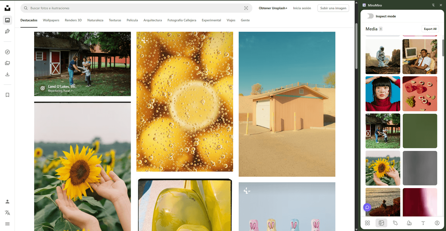
Install the MiroMiro Chrome extension and browse the reference site.
Hover over any SVG-logo, icon, illustration. Click once. MiroMiro copies clean, optimized SVG markup to your clipboard. Paste directly into Figma or save as a file.
For icon sets specifically: visit the reference site's UI, hover each icon, copy. Building a collection of 20 icons takes 5 minutes.
Download images
Still in MiroMiro, hover over any image-hero photo, product screenshot, background texture. Click to download at the highest available resolution.
For reference purposes (mood boards, client presentations, internal design documents), this is completely fine. Remember to replace with licensed or original assets before shipping to production.
Phase 2: Foundation - Build the Figma Library
With your JSON tokens and assets collected, now you build the Figma foundation.
Create a "Design System" Figma file
Keep this separate from component files. It's the single source of truth that everything else references.
Structure:
📄 Design System
  📋 Color Styles
  📋 Text Styles
  📋 Effect Styles
  📋 Icons & Logos
  📋 Components / Primitives
Add color styles
For each color in your extracted JSON:
- Create a rectangle in Figma
- Fill with the hex value
- Right-click → Edit Style → name it semantically
Use a naming convention that matches your code:
| Figma Style Name | Hex | Code Variable |
|---|---|---|
Brand/Primary | #7c3aed | --color-primary |
Brand/Primary Dark | #6d28d9 | --color-primary-dark |
Text/Default | #18181b | --color-text |
Text/Muted | #71717a | --color-text-muted |
Background/Default | #ffffff | --color-bg |
Background/Subtle | #f4f4f5 | --color-bg-subtle |
Semantic/Success | #16a34a | --color-success |
Semantic/Danger | #dc2626 | --color-danger |
When a designer applies Brand/Primary to a button in Figma, the developer uses --color-primary or bg-primary in code. Same color. No translation step.
Add text styles
Create named text styles for every type ramp level:
Heading/Display   - 48px, Bold, 1.1 line height
Heading/1         - 36px, Bold, 1.2 line height
Heading/2         - 30px, Semibold, 1.25 line height
Heading/3         - 24px, Semibold, 1.3 line height
Body/Large        - 18px, Regular, 1.6 line height
Body/Base         - 16px, Regular, 1.6 line height
Body/Small        - 14px, Regular, 1.5 line height
Label/Base        - 14px, Medium, 1.4 line height
Label/Small       - 12px, Medium, 1.3 line height
Code/Base         - 14px, Regular (mono), 1.6 line height
These match the extracted font sizes from the reference site. When a designer specs "Heading/2" on a component, the developer knows it's text-3xl font-semibold leading-snug in Tailwind-or --text-3xl with font-weight: 600 in vanilla CSS.
Add effect styles
Shadows, blurs, and inner shadows:
Elevation/0   - No shadow (flat)
Elevation/1   - 0 1px 2px rgba(0,0,0,0.05)        (subtle)
Elevation/2   - 0 4px 6px -1px rgba(0,0,0,0.1)    (card)
Elevation/3   - 0 10px 15px -3px rgba(0,0,0,0.1)  (dropdown)
Elevation/4   - 0 20px 25px -5px rgba(0,0,0,0.1)  (modal)
Add icons
Paste copied SVGs directly into Figma. Organize into a grid:
- Name each icon:
icon/arrow-right,icon/check,icon/x - Group by category if you have many
- Set
fillto use "current color" (Figma: use a style that referencesText/Default)
Now when a designer uses the icon library, the developer can find the same SVG file and use it directly in code.
Phase 3: Code Foundation - CSS Variables and Tailwind Config
While the Figma file is being built, the developer sets up the code foundation in parallel.
CSS variables (for any framework)
/* styles/tokens.css */
:root {
  /* Brand colors */
  --color-primary: #7c3aed;
  --color-primary-dark: #6d28d9;
  --color-primary-light: #8b5cf6;

  /* Semantic colors */
  --color-success: #16a34a;
  --color-warning: #f59e0b;
  --color-danger: #dc2626;

  /* Text */
  --color-text: #18181b;
  --color-text-muted: #71717a;
  --color-text-subtle: #a1a1aa;

  /* Backgrounds */
  --color-bg: #ffffff;
  --color-bg-subtle: #f4f4f5;
  --color-bg-emphasis: #e4e4e7;

  /* Typography */
  --font-sans: Inter, system-ui, -apple-system, sans-serif;
  --font-mono: JetBrains Mono, Menlo, monospace;

  /* Font sizes */
  --text-xs: 0.75rem;
  --text-sm: 0.875rem;
  --text-base: 1rem;
  --text-lg: 1.125rem;
  --text-xl: 1.25rem;
  --text-2xl: 1.5rem;
  --text-3xl: 1.875rem;
  --text-4xl: 2.25rem;

  /* Spacing */
  --space-1: 0.25rem;
  --space-2: 0.5rem;
  --space-3: 0.75rem;
  --space-4: 1rem;
  --space-6: 1.5rem;
  --space-8: 2rem;
  --space-12: 3rem;
  --space-16: 4rem;
  --space-24: 6rem;

  /* Border radius */
  --radius-sm: 0.25rem;
  --radius-base: 0.375rem;
  --radius-md: 0.5rem;
  --radius-lg: 0.75rem;
  --radius-xl: 1rem;
  --radius-2xl: 1.5rem;
  --radius-full: 9999px;

  /* Shadows */
  --shadow-sm: 0 1px 2px rgba(0, 0, 0, 0.05);
  --shadow-md: 0 4px 6px -1px rgba(0, 0, 0, 0.1), 0 2px 4px -2px rgba(0, 0, 0, 0.1);
  --shadow-lg: 0 10px 15px -3px rgba(0, 0, 0, 0.1), 0 4px 6px -4px rgba(0, 0, 0, 0.1);
  --shadow-xl: 0 20px 25px -5px rgba(0, 0, 0, 0.1), 0 8px 10px -6px rgba(0, 0, 0, 0.1);

  /* Transitions */
  --transition-fast: 150ms ease-out;
  --transition-base: 250ms ease-out;
  --transition-slow: 400ms cubic-bezier(0.16, 1, 0.3, 1);
}
Tailwind config (for Tailwind projects)
// tailwind.config.js
module.exports = {
  theme: {
    extend: {
      colors: {
        primary: {
          DEFAULT: '#7c3aed',
          dark: '#6d28d9',
          light: '#8b5cf6',
        },
        success: '#16a34a',
        warning: '#f59e0b',
        danger: '#dc2626',
      },
      fontFamily: {
        sans: ['Inter', 'system-ui', '-apple-system', 'sans-serif'],
        mono: ['JetBrains Mono', 'Menlo', 'monospace'],
      },
      borderRadius: {
        '2xl': '1rem',
        '3xl': '1.5rem',
      },
      boxShadow: {
        card: '0 4px 6px -1px rgba(0, 0, 0, 0.1), 0 2px 4px -2px rgba(0, 0, 0, 0.1)',
        elevated: '0 20px 25px -5px rgba(0, 0, 0, 0.1), 0 8px 10px -6px rgba(0, 0, 0, 0.1)',
      },
      transitionTimingFunction: {
        bouncy: 'cubic-bezier(0.16, 1, 0.3, 1)',
      }
    }
  }
}
Both files come directly from the extracted JSON. No guessing, no iteration. First draft is accurate.
Phase 4: Component Building
With tokens set up in both Figma and code, components can be built in parallel.
Shortcut: Export sections directly to code
For layouts you want to move on quickly - a hero, a pricing table, a nav - MiroMiro's section export lets you skip the initial layout phase.
Browse to the reference site, hover over the section, select the block, and MiroMiro exports it as clean HTML & CSS. You get the full structure ready to drop into your project, styled with the actual values from the page.
From there you adapt: swap in your own content, apply your token variable names, remove anything you don't need. It's a starting point, not a finished product - but it saves the blank-canvas problem of writing layout from scratch.
The handoff is clear
When a designer hands off a component in Figma:
- Colors reference named styles (
Brand/Primary) → developer usesvar(--color-primary)ortext-primary - Text uses named text styles (
Body/Base) → developer knows it's16px / 1.6ortext-base leading-relaxed - Spacing and radius are documented in the design → developer has the exact token
No more "what shade of gray is that?" or "is that 12px or 14px border radius?"
Code components reference the same tokens
// Button.tsx
function Button({ variant = 'primary', children, ...props }) {
  return (
    <button
      className={`
        rounded-xl px-5 py-2.5 text-sm font-semibold
        transition-colors duration-150
        ${variant === 'primary'
          ? 'bg-primary text-white hover:bg-primary-dark'
          : 'border border-neutral-200 bg-white text-neutral-900 hover:bg-neutral-50'
        }
      `}
      {...props}
    >
      {children}
    </button>
  )
}
rounded-xl, bg-primary, text-sm-every class maps to a token from the shared foundation.
Phase 5: Staying in Sync
The workflow keeps design and code aligned over time.
When a designer updates a token
- Update the color/text/effect style in the Figma library
- Update the corresponding CSS variable or Tailwind config value in code
- Both places are updated from the same decision
When a developer needs a new token
- Add it to
tokens.cssfirst - Communicate the new token to the designer
- Designer adds a matching style to the Figma library
When the reference site updates
Run MiroMiro on the updated URL. Compare the new extraction to your existing tokens. Adopt intentional changes, ignore incidental ones.
What This Workflow Solves
| Problem | How This Workflow Fixes It |
|---|---|
| Figma doesn't match production | Both start from the same extracted token values |
| Developers guess at spacing | CSS variables and Tailwind config give exact values to use |
| Tokens defined in Figma but not in code | Extraction creates both simultaneously |
| Slow reference gathering | MiroMiro reduces research from hours to minutes |
| SVG icons lost between design and code | Same SVG file used in Figma and in code |
| Designer specifies one thing, developer builds another | Shared token names create a common language |
Who This Workflow Is For
Solo designers who code: Use extraction to set up your project foundation fast. Skip the research phase and get to building.
Designer-developer duos: Run extraction together on the first day. Everyone starts from the same tokens. Handoffs become much simpler.
Small agencies: When you're delivering a new site for each client, extraction gives you a 20-minute project bootstrap instead of a 2-day design research phase.
Frontend developers working from a reference: Your designer isn't available, but there's a reference site. Extract, build, share the tokens with your designer when they check in.
Tools in This Workflow
| Tool | Role | Cost |
|---|---|---|
| MiroMiro | Token extraction, SVG copying, image download, section export | Free plan available |
| Figma | Design library and component building | Free / paid |
| Browser DevTools | Structure inspection | Free (built-in) |
| Style Dictionary (optional) | Token transformation pipeline | Free (open source) |
| Tokens Studio (optional) | Two-way Figma-code sync | Paid plugin |
MiroMiro handles the extraction and code export. Everything else is your existing toolchain.
Conclusion: One Source of Truth, Two Destinations
The designer-developer gap isn't a people problem. It's a process problem. When design and code start from different sources of truth, mismatches are inevitable.
The workflow in this guide:
- Extracts the real visual values from a reference or production site
- Builds a Figma library from those exact values
- Sets up the codebase from those exact same values
- Keeps both aligned through shared token names
Design and code speak the same language because they were given the same dictionary.
Start Extracting with MiroMiro →
Questions about your specific workflow setup? Reach out on Twitter or explore our design tools.
Keep Reading
- Design Tokens: The Complete Guide: Everything you need to know about design tokens
- How to Clone a Website Section to React & Tailwind Code: Export sections as production code
- Design Token Extractor: Extract tokens from any live website
- Inspect & Export to Code: Export entire sections as clean code