Color contrast isn't just about aesthetics – it's about making your website readable for everyone. Poor contrast excludes millions of users with visual impairments and fails WCAG accessibility standards.
In this guide, I'll explain WCAG contrast requirements, show you how to check color contrast compliance, and help you fix common issues. Let's make the web more accessible.
What Is WCAG Color Contrast?
WCAG (Web Content Accessibility Guidelines) sets minimum contrast ratios between text and background colors to ensure readability for people with visual impairments, including color blindness and low vision.
- 21% of people have some form of visual impairment
- 8% of men are colorblind (1 in 12)
- Legal requirement in many countries (ADA, EAA, etc.)
- Better UX for everyone – easier reading in bright sunlight, on low-quality screens, etc.
Think of contrast ratio as the difference in brightness between two colors. A ratio of 1:1 means no difference (white on white), while 21:1 is maximum contrast (black on white).
WCAG Contrast Requirements: 4.5:1 vs 3:1 Explained
WCAG 2.1 defines two compliance levels with different contrast ratios:
Level AA (Minimum Standard)
Normal text (under 18pt or 14pt bold):
- 4.5:1 minimum contrast ratio
- Most body text, buttons, form labels
Large text (18pt+ or 14pt+ bold):
- 3:1 minimum contrast ratio
- Headings, large UI elements
Level AAA (Enhanced Standard)
Normal text:
- 7:1 minimum contrast ratio
- Ideal for healthcare, government, education sites
Large text:
- 4.5:1 minimum contrast ratio
Common Color Contrast Mistakes
Here are the most common contrast failures we see:
1. Light Gray Text on White Backgrounds
/* ❌ FAILS - Contrast ratio 2.6:1 */
color: #999999;
background: #ffffff;

/* ✅ PASSES AA - Contrast ratio 4.5:1 */
color: #767676;
background: #ffffff;
2. Brand Colors That Don't Meet Standards
Your beautiful brand purple might look great but fail accessibility:
/* ❌ FAILS - Purple on white (3.7:1) */
color: #a855f7;
background: #ffffff;

/* ✅ PASSES AA - Darker purple (4.6:1) */
color: #9333ea;
background: #ffffff;
3. Insufficient Button Contrast
/* ❌ FAILS - Light button text (2.9:1) */
background: #60a5fa;
color: #ffffff;

/* ✅ PASSES AA - Darker background (4.5:1) */
background: #2563eb;
color: #ffffff;
4. Links That Blend with Body Text
Links must have 3:1 contrast with surrounding text OR use a non-color indicator (underline, bold, etc.).
How to Check Color Contrast (3 Methods)
Method 1: MiroMiro Contrast Checker (Instant)
Our free contrast checker tool lets you test any color combination instantly:
- Visit MiroMiro Contrast Checker
- Enter your foreground color (text)
- Enter your background color
- See instant WCAG AA/AAA results
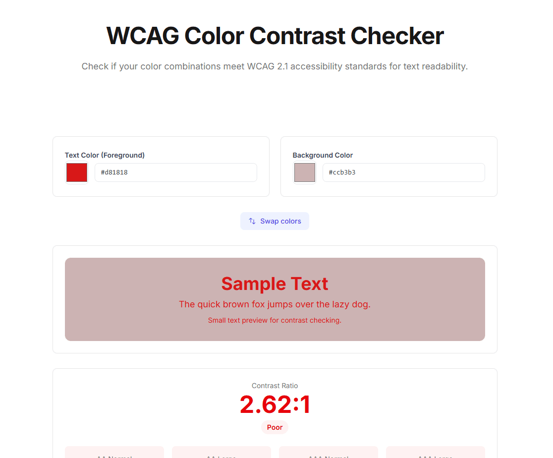
Test color combinations and get instant WCAG compliance feedback.
The tool shows:
- ✅ Pass/Fail for AA and AAA levels
- Exact contrast ratio (e.g., 4.52:1)
- Separate results for normal and large text
- Suggested color adjustments to pass
Method 2: MiroMiro Chrome Extension (Live Websites)
Want to check contrast on existing websites? Use the MiroMiro extension:
- Install MiroMiro Chrome Extension
- Enable Inspector Mode
- Hover over any text element
- See live contrast ratio and WCAG compliance
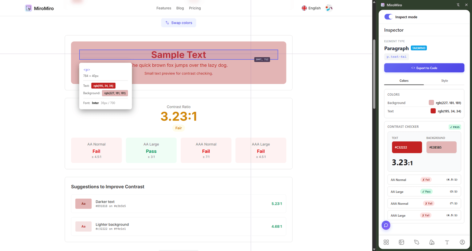
Check contrast ratios on any website in real-time with MiroMiro's inspector.
This is perfect for:
- Auditing your own website
- Learning from accessible designs
- Quick compliance checks during development
Method 3: Browser DevTools
Chrome and Firefox have built-in contrast checkers:
Chrome DevTools:
- Right-click text element → Inspect
- Look at the Styles panel
- Click the color square next to the color value
- See contrast ratio in the color picker
Firefox DevTools:
- Right-click text element → Inspect
- Click Accessibility tab
- View "Contrast" section
Fixing Low Contrast: Best Practices
Strategy 1: Darken Text or Lighten Background
The simplest fix – adjust one color to increase contrast:
/* Before: 3.2:1 (fails) */
color: #6b7280;
background: #f3f4f6;

/* After: 4.6:1 (passes) */
color: #4b5563; /* Darker text */
background: #f3f4f6;
Strategy 2: Use Outline/Border for Separation
For subtle designs, add a border to create visual separation:
/* Low contrast acceptable when bordered */
background: #f0f0f0;
border: 1px solid #d1d5db;
color: #6b7280;
Strategy 3: Increase Font Weight
Bolder text is more readable at lower contrast (especially for large text):
/* 18pt+ and bold = large text (3:1 minimum) */
font-size: 18pt;
font-weight: 700;
color: #8b5cf6; /* 3.3:1 ratio - passes for large text */
Strategy 4: Use Accessible Color Palettes
Build your palette with contrast in mind. Here are WCAG-compliant combinations:
Purple palette:
#6b21a8on#ffffff– 8.59:1 (AAA)#9333eaon#ffffff– 4.69:1 (AA)#ffffffon#7c3aed– 4.03:1 (AA for large text)
Blue palette:
#1e40afon#ffffff– 9.67:1 (AAA)#2563ebon#ffffff– 5.14:1 (AA)#ffffffon#3b82f6– 3.28:1 (AA for large text)
Gray palette:
#1f2937on#ffffff– 14.98:1 (AAA)#4b5563on#ffffff– 8.59:1 (AAA)#6b7280on#ffffff– 4.69:1 (AA)
What About Non-Text Elements?
WCAG 2.1 introduced Success Criterion 1.4.11 for non-text contrast:
UI Components (buttons, form inputs, icons):
- 3:1 minimum contrast ratio with adjacent colors
- Applies to borders, backgrounds, focus indicators
Graphical Objects (charts, icons, diagrams):
- 3:1 minimum contrast ratio for essential parts
Example:
/* ❌ FAILS - Input border too light (1.8:1) */
input {
  border: 1px solid #e5e7eb;
  background: #ffffff;
}

/* ✅ PASSES - Darker border (3.1:1) */
input {
  border: 1px solid #9ca3af;
  background: #ffffff;
}
Testing Your Entire Website
Manually checking every color is tedious. Here's how to automate:
1. Browser Extensions
- MiroMiro – Inspect colors on any element
- axe DevTools – Full accessibility audit including contrast
- WAVE – Visual feedback overlay
2. Automated Testing Tools
- Lighthouse (built into Chrome) – Accessibility score
- Pa11y – Command-line testing
- axe-core – Integrate into CI/CD pipeline
3. Design Tool Plugins
- Figma: Stark, A11y - Contrast Checker
- Sketch: Contrast
- Adobe XD: Color Contrast Analyzer
FAQ: WCAG Color Contrast
What is the minimum contrast ratio for WCAG AA?
4.5:1 for normal text (under 18pt or 14pt bold) and 3:1 for large text (18pt+ or 14pt+ bold). These are Level AA requirements that most websites must meet for legal compliance.
Does WCAG apply to logos and decorative text?
No. WCAG contrast requirements apply to functional text only. Logos, brand names, and decorative text that doesn't convey essential information are exempt. However, accessibility best practices suggest making even decorative text readable when possible.
What's the difference between WCAG 2.0, 2.1, and 2.2?
All versions have the same contrast requirements (4.5:1 for AA, 7:1 for AAA). WCAG 2.1 added non-text contrast (3:1). WCAG 2.2 (latest) added focus appearance requirements. Use WCAG 2.1 Level AA as your baseline.
Can I use white text on a purple background?
Yes, if the purple is dark enough. For example:
- ✅
#ffffffon#6b21a8= 8.59:1 (passes AAA) - ✅
#ffffffon#7c3aed= 4.03:1 (passes AA for large text) - ❌
#ffffffon#a855f7= 2.70:1 (fails)
Always test your specific combination with a contrast checker.
Do I need to fix contrast on disabled buttons?
No. WCAG explicitly excludes disabled/inactive UI components from contrast requirements. However, some accessibility experts recommend maintaining readable contrast on disabled elements to help users understand what's unavailable.
What if my brand colors don't meet WCAG standards?
You have options:
- Use brand colors for large headings (3:1 minimum)
- Darken the shade slightly for body text
- Use brand color as accent with compliant text colors
- Add white text on brand background if contrast is sufficient
Many brands have accessible and non-accessible versions of their palette.
Conclusion: Make Contrast Checking Part of Your Workflow
Color contrast isn't optional – it's a fundamental part of building accessible websites. By following WCAG 2.1 guidelines and using tools like MiroMiro's contrast checker, you can ensure your site is readable for everyone.
Quick recap:
- ✅ Use 4.5:1 minimum for normal text (AA compliance)
- ✅ Use 3:1 minimum for large text (18pt+) and UI components
- ✅ Test early and often with contrast checkers
- ✅ Build accessible color palettes from the start
Ready to check your website's contrast? Try our free tools:
Have questions about WCAG compliance? Found this guide helpful? Share it with your team or reach out on Twitter.
Herramientas de Diseño Gratuitas
Prueba nuestras herramientas online gratuitas, sin registro: