You've probably heard designers and developers talk about design tokens, but what exactly are they? And more importantly, how can they make your design workflow 10x faster?
In this comprehensive guide, I'll explain what design tokens are, why they matter, and show you how to extract them from any website using MiroMiro. Let's dive in.
What Are Design Tokens?
Design tokens are named entities that store visual design attributes – like colors, typography, spacing, and shadows – in a format that can be shared across platforms and tools.
Think of them as variables for your entire design system.
Before Design Tokens:
/* Colors scattered everywhere */
.button {
  background: #6b21a8;
}
.header {
  color: #6b21a8;
}
.badge {
  border: 1px solid #6b21a8;
}
After Design Tokens:
/* Single source of truth */
--color-primary: #6b21a8;

.button {
  background: var(--color-primary);
}
.header {
  color: var(--color-primary);
}
.badge {
  border: 1px solid var(--color-primary);
}
Now if you want to change your primary color, you update one token instead of hunting through hundreds of files.
- Single source of truth – Update once, apply everywhere
- Platform agnostic – Share between web, iOS, Android, design tools
- Maintainable – No more magic numbers scattered in code
- Scalable – Add new values without breaking existing ones
- Consistent – Designers and developers use the same values
Types of Design Tokens
Design tokens cover every aspect of visual design. Here are the main categories:
1. Color Tokens
The most common type – stores all color values in your design system.
{
  "color": {
    "primary": "#6b21a8",
    "secondary": "#2563eb",
    "success": "#16a34a",
    "danger": "#dc2626",
    "text": {
      "primary": "#1f2937",
      "secondary": "#6b7280",
      "disabled": "#9ca3af"
    },
    "background": {
      "primary": "#ffffff",
      "secondary": "#f9fafb",
      "tertiary": "#f3f4f6"
    }
  }
}
2. Typography Tokens
Font families, sizes, weights, line heights, and letter spacing.
{
  "typography": {
    "family": {
      "sans": "Inter, system-ui, sans-serif",
      "mono": "JetBrains Mono, monospace"
    },
    "size": {
      "xs": "0.75rem",
      "sm": "0.875rem",
      "base": "1rem",
      "lg": "1.125rem",
      "xl": "1.25rem",
      "2xl": "1.5rem"
    },
    "weight": {
      "normal": "400",
      "medium": "500",
      "semibold": "600",
      "bold": "700"
    },
    "lineHeight": {
      "tight": "1.25",
      "normal": "1.5",
      "relaxed": "1.75"
    }
  }
}
3. Spacing Tokens
Consistent spacing for margins, padding, and gaps.
{
  "spacing": {
    "0": "0",
    "1": "0.25rem",
    "2": "0.5rem",
    "3": "0.75rem",
    "4": "1rem",
    "6": "1.5rem",
    "8": "2rem",
    "12": "3rem",
    "16": "4rem"
  }
}
4. Border Radius Tokens
Rounded corners for cards, buttons, and inputs.
{
  "radius": {
    "none": "0",
    "sm": "0.125rem",
    "base": "0.25rem",
    "md": "0.375rem",
    "lg": "0.5rem",
    "xl": "0.75rem",
    "2xl": "1rem",
    "full": "9999px"
  }
}
5. Shadow Tokens
Drop shadows and elevation levels.
{
  "shadow": {
    "sm": "0 1px 2px 0 rgba(0, 0, 0, 0.05)",
    "base": "0 1px 3px 0 rgba(0, 0, 0, 0.1)",
    "md": "0 4px 6px -1px rgba(0, 0, 0, 0.1)",
    "lg": "0 10px 15px -3px rgba(0, 0, 0, 0.1)",
    "xl": "0 20px 25px -5px rgba(0, 0, 0, 0.1)"
  }
}
6. Animation/Motion Tokens
Timing, easing, and duration for animations.
{
  "animation": {
    "duration": {
      "fast": "150ms",
      "base": "300ms",
      "slow": "500ms"
    },
    "easing": {
      "linear": "linear",
      "ease": "ease",
      "in": "cubic-bezier(0.4, 0, 1, 1)",
      "out": "cubic-bezier(0, 0, 0.2, 1)"
    }
  }
}
Design Tokens vs CSS Variables: What's the Difference?
Great question! They're related but not the same:
Design Tokens:
- Platform-agnostic format (usually JSON)
- Can be transformed into CSS, SCSS, iOS, Android, etc.
- Single source of truth for design decisions
- Often managed by design teams in tools like Figma
CSS Variables:
- Browser-native implementation (
--variable-name) - Only works in CSS/web contexts
- Runtime dynamic values
- Developer-implemented in code
The workflow:
- Design tokens are defined in JSON (design system)
- Build tools transform them into CSS variables (web)
- Also transformed into Swift/Kotlin/XML for native apps
// Design token (source of truth)
{
  "color-primary": "#6b21a8"
}
↓ Transformed into ↓
/* CSS variables (web) */
:root {
  --color-primary: #6b21a8;
}
// Swift (iOS)
let colorPrimary = UIColor(hex: "#6b21a8")
// Kotlin (Android)
val colorPrimary = Color(0xFF6b21a8)
How to Extract Design Tokens from Any Website
Want to learn from the best-designed websites? MiroMiro lets you extract design tokens from any live website instantly.
Step 1: Visit MiroMiro Design Token Extractor
Go to MiroMiro's Design Token Extractor and enter any website URL. Our tool will analyze the entire design system.
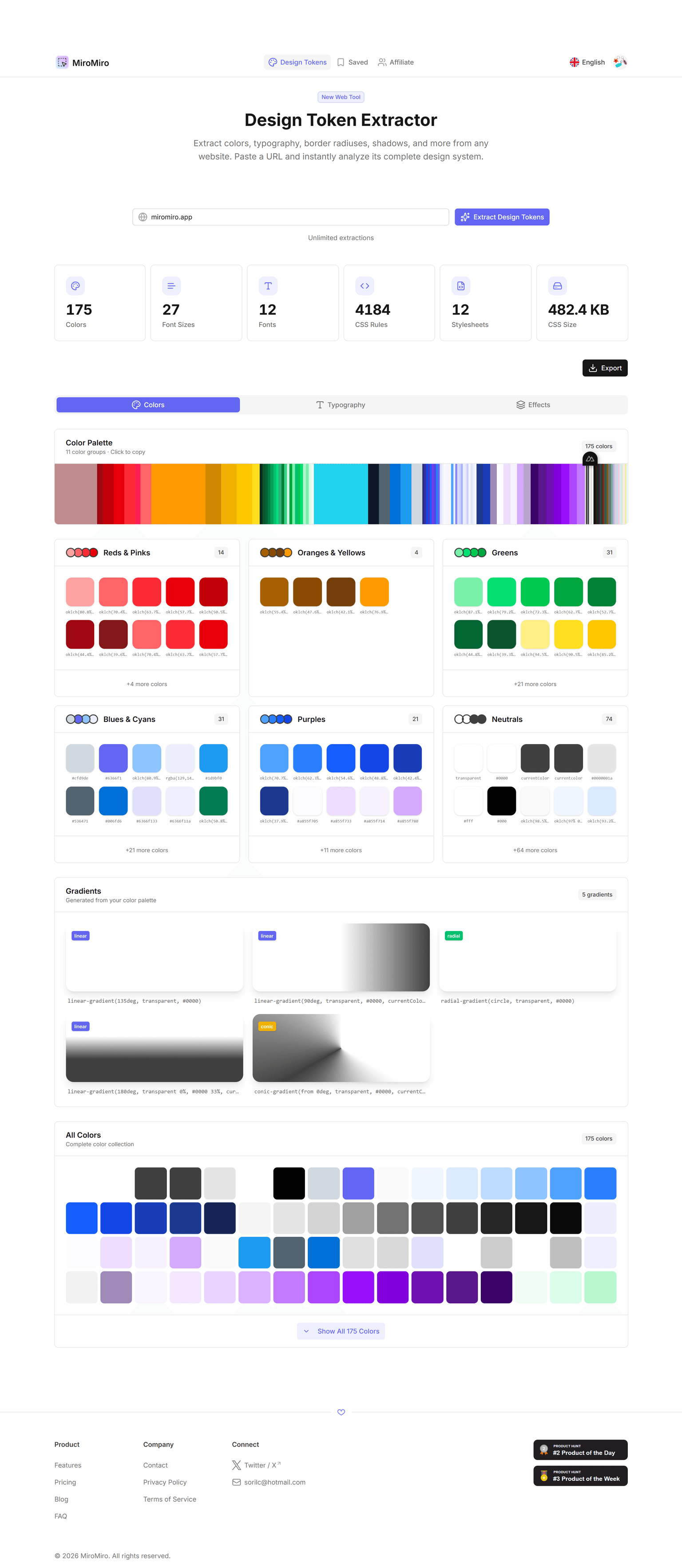
Extract design tokens from any website by entering a URL.
Step 2: View Extracted Tokens
MiroMiro automatically detects:
- Colors – Primary, secondary, backgrounds, text colors
- Typography – Font families, sizes, weights, line heights
- Spacing – Consistent padding/margin values used throughout
- Border Radius – Roundedness patterns for UI elements
- Shadows – Elevation and depth tokens

See all extracted tokens organized by category with live previews.
Step 3: Export in Your Format
Download tokens in multiple formats:
- JSON – Universal format for design systems
- CSS Variables – Ready to use in your stylesheets
- SCSS Variables – For Sass/SCSS projects
- Tailwind Config – Drop into
tailwind.config.js
// Exported JSON tokens
{
  "colors": {
    "purple-50": "#faf5ff",
    "purple-100": "#f3e8ff",
    "purple-500": "#a855f7",
    "purple-700": "#7c3aed",
    "purple-900": "#6b21a8"
  },
  "spacing": {
    "4": "1rem",
    "6": "1.5rem",
    "8": "2rem"
  },
  "fontFamily": {
    "sans": "Inter, sans-serif"
  }
}
Step 4: Import into Your Project
Copy the tokens into your project and start using them immediately:
/* Import extracted tokens */
:root {
  --purple-500: #a855f7;
  --purple-700: #7c3aed;
  --spacing-4: 1rem;
  --font-sans: Inter, sans-serif;
}

/* Use in your components */
.button {
  background: var(--purple-700);
  padding: var(--spacing-4);
  font-family: var(--font-sans);
}
Use Cases: When to Extract Design Tokens
1. Competitive Research
See how top companies structure their design systems:
- Extract Stripe's color palette
- Study Notion's typography scale
- Analyze Linear's spacing system
2. Design System Audit
Audit your own website to discover inconsistencies:
- "We're using 47 different shades of gray!"
- "12 different font sizes when we only need 6"
- "Random spacing values instead of a scale"
MiroMiro shows you exactly what's being used, helping you consolidate.
3. Redesign Starting Point
Migrating to a new design system? Extract your current tokens to:
- Document what exists today
- Map old values to new ones
- Ensure nothing is missed in migration
4. Client Projects
Quickly match a client's existing brand:
- Extract their current site's colors and typography
- Use those tokens as your starting point
- Maintain visual consistency during rebuild
5. Learning from Great Design
Study design patterns from beautiful websites:
- How does Apple space their content?
- What typography scale does Vercel use?
- How does Stripe structure their color system?
Building Your Own Design Token System
Ready to create tokens for your project? Here's a simple framework:
Step 1: Define Your Color Palette
Start with semantic colors (not just "blue-500"):
{
  "color": {
    "brand": {
      "primary": "#6b21a8",
      "secondary": "#2563eb"
    },
    "semantic": {
      "success": "#16a34a",
      "warning": "#f59e0b",
      "danger": "#dc2626",
      "info": "#0891b2"
    },
    "neutral": {
      "50": "#fafafa",
      "100": "#f4f4f5",
      "500": "#71717a",
      "900": "#18181b"
    }
  }
}
Step 2: Create Typography Scale
Use a modular scale (like 1.25 or 1.333):
{
  "fontSize": {
    "xs": "0.75rem",    // 12px
    "sm": "0.875rem",   // 14px
    "base": "1rem",     // 16px
    "lg": "1.125rem",   // 18px
    "xl": "1.25rem",    // 20px
    "2xl": "1.5rem",    // 24px
    "3xl": "1.875rem",  // 30px
    "4xl": "2.25rem"    // 36px
  }
}
Step 3: Define Spacing Scale
Use a consistent 4px or 8px base unit:
{
  "spacing": {
    "0": "0",
    "1": "0.25rem",  // 4px
    "2": "0.5rem",   // 8px
    "3": "0.75rem",  // 12px
    "4": "1rem",     // 16px
    "6": "1.5rem",   // 24px
    "8": "2rem",     // 32px
    "12": "3rem",    // 48px
    "16": "4rem"     // 64px
  }
}
Step 4: Add Border & Shadow Tokens
Define reusable border and shadow values:
{
  "borderRadius": {
    "sm": "0.125rem",
    "base": "0.25rem",
    "md": "0.375rem",
    "lg": "0.5rem",
    "xl": "0.75rem",
    "full": "9999px"
  },
  "boxShadow": {
    "sm": "0 1px 2px rgba(0,0,0,0.05)",
    "base": "0 1px 3px rgba(0,0,0,0.1)",
    "md": "0 4px 6px rgba(0,0,0,0.1)",
    "lg": "0 10px 15px rgba(0,0,0,0.1)"
  }
}
Step 5: Transform to CSS Variables
Convert JSON to CSS with a build script or manually:
:root {
  /* Colors */
  --color-brand-primary: #6b21a8;
  --color-brand-secondary: #2563eb;

  /* Typography */
  --font-size-base: 1rem;
  --font-size-lg: 1.125rem;

  /* Spacing */
  --spacing-4: 1rem;
  --spacing-6: 1.5rem;

  /* Border radius */
  --radius-base: 0.25rem;
  --radius-lg: 0.5rem;
}
Design Token Tools & Ecosystem
Design Tools
- Figma – Tokens Studio plugin for syncing tokens
- Sketch – Style Dictionary integration
- Adobe XD – Design tokens plugin
Build Tools
- Style Dictionary – Amazon's open-source token transformer
- Theo – Salesforce's design token toolkit
- Design Tokens CLI – W3C format converter
Frameworks with Built-in Tokens
- Tailwind CSS – Built on design tokens (colors, spacing, etc.)
- Chakra UI – Theme tokens for React
- shadcn/ui – CSS variable-based tokens
- MUI (Material-UI) – Design token theming
FAQ: Design Tokens
Are design tokens the same as CSS variables?
No. Design tokens are platform-agnostic definitions (usually JSON) that can be transformed into CSS variables, iOS colors, Android resources, and more. CSS variables are one implementation of design tokens for the web.
Do I need a design system to use design tokens?
Not necessarily! Even small projects benefit from tokens. Start simple with colors and spacing. As your project grows, add more token categories. Tokens make refactoring and theming much easier.
Can I extract design tokens from any website?
Yes! MiroMiro's design token extractor analyzes any website and extracts colors, typography, spacing, and more. It's perfect for competitive research, learning from great designs, or auditing your own site.
What's the difference between primitive and semantic tokens?
Primitive tokens are raw values:
purple-700: #7c3aed
Semantic tokens reference primitives with meaning:
color-primary: purple-700button-background: color-primary
This lets you change purple-700 once and update all components that use "primary" color.
How do I share design tokens between designers and developers?
Use tools like:
- Figma Tokens Studio – Sync Figma variables to code
- Style Dictionary – Transform tokens to any format
- GitHub – Version control your token JSON files
The key is a single source of truth (usually a JSON file) that both designers and developers reference.
Can design tokens improve website performance?
Indirectly, yes. Tokens encourage reuse and consistency, which means:
- Smaller CSS files (fewer unique values)
- Better caching (consistent class names)
- Easier tree-shaking (remove unused tokens)
Conclusion: Start Using Design Tokens Today
Design tokens are the foundation of scalable, maintainable design systems. Whether you're building a new project or refactoring an old one, tokens will save you countless hours and prevent inconsistencies.
Quick recap:
- ✅ Define tokens once – Use everywhere (web, iOS, Android)
- ✅ Extract from existing sites – Learn from the best designs
- ✅ Start simple – Colors and spacing go a long way
- ✅ Use semantic naming – Make tokens meaningful, not descriptive
Ready to extract design tokens from your favorite websites?
Questions about design tokens? Want to share your design system? Reach out on Twitter or check out our other design tools.
Herramientas de Diseño Gratuitas
Prueba nuestras herramientas online gratuitas, sin registro: